
Indiva
Indiva
Social Media
Motion Graphics
Scratchpad
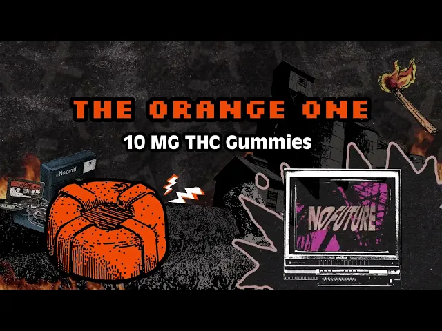
At Scratchpad Studio in Toronto, I worked on the ongoing visual presence of Indiva, a licensed cannabis producer with a portfolio of distinct sub-brands. Each brand carried its own tone, audience, and aesthetic, so the challenge wasn't just producing content at volume. It was protecting separate identities while keeping everything coherent under the larger Indiva umbrella.
At Scratchpad Studio in Toronto, I worked on the ongoing visual presence of Indiva, a licensed cannabis producer with a portfolio of distinct sub-brands. Each brand carried its own tone, audience, and aesthetic, so the challenge wasn't just producing content at volume. It was protecting separate identities while keeping everything coherent under the larger Indiva umbrella.



Process
Process
The work spanned social media, print, and motion graphics. Every product drop and campaign needed to feel intentional and on-brand, whether it was landing on someone's feed or on a screen inside a dispensary. That meant understanding what made each sub-brand distinct and designing to that, not just applying the same template across the board.
Sub-brands like Doppio, Bhang, Daily Special, and PB32 each had their own visual language. Part of my role was making sure assets for one never bled into another, while still reading as part of the same family at the retail level.
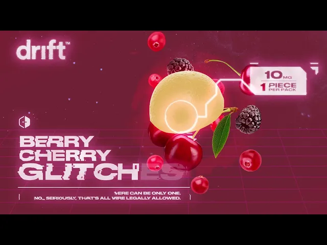
Beyond social, product launches were supported with motion graphics and dispensary-ready advertising packages, designed to translate cleanly from a phone screen to an in-store display without losing impact.
The work spanned social media, print, and motion graphics. Every product drop and campaign needed to feel intentional and on-brand, whether it was landing on someone's feed or on a screen inside a dispensary. That meant understanding what made each sub-brand distinct and designing to that, not just applying the same template across the board.
Sub-brands like Doppio, Bhang, Daily Special, and PB32 each had their own visual language. Part of my role was making sure assets for one never bled into another, while still reading as part of the same family at the retail level.
Beyond social, product launches were supported with motion graphics and dispensary-ready advertising packages, designed to translate cleanly from a phone screen to an in-store display without losing impact.



The focus throughout was clarity, consistency, and elevating brand perception in a competitive market. Working across this many distinct identities at once, under real agency deadlines, sharpened my ability to switch contexts quickly and produce work that feels considered rather than templated.
The focus throughout was clarity, consistency, and elevating brand perception in a competitive market. Working across this many distinct identities at once, under real agency deadlines, sharpened my ability to switch contexts quickly and produce work that feels considered rather than templated.
The focus throughout was clarity, consistency, and elevating brand perception in a competitive market. Working across this many distinct identities at once, under real agency deadlines, sharpened my ability to switch contexts quickly and produce work that feels considered rather than templated.
Outcome
Outcome
