
Wild Wood is a fictional winery designed for a school packaging project at Georgian College. The brief had a specific challenge at its core: create a series of wine labels that are clearly distinguishable from one another, but still read as a cohesive family at a glance. The subject matter I built the brand around was wild-fermented wines, a natural wine style with a funkier, more unpredictable character than traditional varieties. That personality informed everything from the brand name to the illustration approach.
Wild Wood is a fictional winery designed for a school packaging project at Georgian College. The brief had a specific challenge at its core: create a series of wine labels that are clearly distinguishable from one another, but still read as a cohesive family at a glance. The subject matter I built the brand around was wild-fermented wines, a natural wine style with a funkier, more unpredictable character than traditional varieties. That personality informed everything from the brand name to the illustration approach.
Wild Wood
Wild Wood
Packaging design
Illustrations
Academic


To solve the series problem, I landed on a consistent visual framework with one variable: the animal. Each label shares the same layout, the same Wild Wood wordmark, the same WW monogram badge, and the same dark label aesthetic. What changes is the painted portrait at the center, a different animal for each varietal, chosen to reflect something about the wine it represents.
Each animal was painted by hand in Photoshop, with enough detail and texture to make every bottle feel distinct up close while the shared system keeps them tied together as a set. The restraint in the typography and layout was intentional, keeping things clean so the illustration could carry the personality without the label feeling busy.
Once the artwork was finalized, I built the 3D mockups in Adobe Dimension, staging all three bottles on a barrel with a wine glass and grapes to show the series together in a realistic setting.
To solve the series problem, I landed on a consistent visual framework with one variable: the animal. Each label shares the same layout, the same Wild Wood wordmark, the same WW monogram badge, and the same dark label aesthetic. What changes is the painted portrait at the center, a different animal for each varietal, chosen to reflect something about the wine it represents.
Each animal was painted by hand in Photoshop, with enough detail and texture to make every bottle feel distinct up close while the shared system keeps them tied together as a set. The restraint in the typography and layout was intentional, keeping things clean so the illustration could carry the personality without the label feeling busy.
Once the artwork was finalized, I built the 3D mockups in Adobe Dimension, staging all three bottles on a barrel with a wine glass and grapes to show the series together in a realistic setting.
To solve the series problem, I landed on a consistent visual framework with one variable: the animal. Each label shares the same layout, the same Wild Wood wordmark, the same WW monogram badge, and the same dark label aesthetic. What changes is the painted portrait at the center, a different animal for each varietal, chosen to reflect something about the wine it represents.
Each animal was painted by hand in Photoshop, with enough detail and texture to make every bottle feel distinct up close while the shared system keeps them tied together as a set. The restraint in the typography and layout was intentional, keeping things clean so the illustration could carry the personality without the label feeling busy.
Once the artwork was finalized, I built the 3D mockups in Adobe Dimension, staging all three bottles on a barrel with a wine glass and grapes to show the series together in a realistic setting.
Process
Process
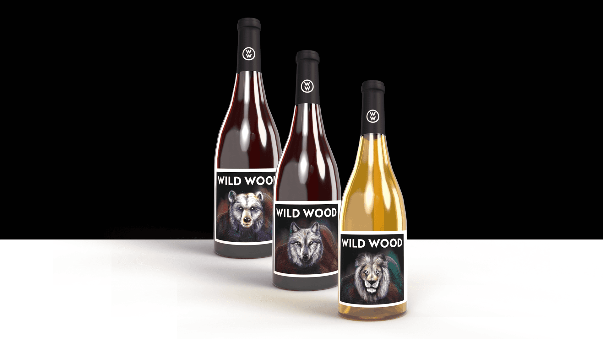
The project directly answered the brief: three bottles that each have their own character but clearly belong to the same brand. It's also a good example of using a consistent design system as a vehicle for variety rather than a constraint against it.
The project directly answered the brief: three bottles that each have their own character but clearly belong to the same brand. It's also a good example of using a consistent design system as a vehicle for variety rather than a constraint against it.
The project directly answered the brief: three bottles that each have their own character but clearly belong to the same brand. It's also a good example of using a consistent design system as a vehicle for variety rather than a constraint against it.
Outcome
Outcome

This was a packaging project from my time at Georgian College. The brief called for designing a series of beer labels targeted at young adults in the 25-30 range, with three distinct variants that could work individually and as a cohesive series.
The concept I landed on was simple: what if beer brands were named after bears? Spirit Beer, Grizzly Beer, Polar Beer, Panda Beer. Each name is a pun, and each label features a custom illustrated mascot that merges a bear and a deer, a "beer" in the most literal sense. Keeping the humour grounded in the illustration meant the labels could stay playful without feeling cheap.
This was a packaging project from my time at Georgian College. The brief called for designing a series of beer labels targeted at young adults in the 25-30 range, with three distinct variants that could work individually and as a cohesive series.
The concept I landed on was simple: what if beer brands were named after bears? Spirit Beer, Grizzly Beer, Polar Beer, Panda Beer. Each name is a pun, and each label features a custom illustrated mascot that merges a bear and a deer, a "beer" in the most literal sense. Keeping the humour grounded in the illustration meant the labels could stay playful without feeling cheap.
Beer
Beer
Packaging Design
Illustration
Illustration
Academic


Process
Process
The main design challenge was building four distinct labels that still read as a family. The solution was a consistent visual system: same mascot structure, same Ghost Brewery wordmark, same label architecture across all variants. What differentiated each one was the colorway and brew style. Red for Spirit (Ale Blonde), orange for Grizzly (Dry Hopped Sour Ale), blue for Polar (Imperial Stout), green for Panda (Hibiscus Sour).
The bear-deer mascot was illustrated in Illustrator and adapted across all four. Once the label artwork was locked in, I brought everything into Adobe Dimension to render photorealistic 3D mockups on swing-top bottles with studio lighting, to show how the labels would actually look in production.
To complete the project, I produced a short motion graphic in After Effects that breaks down the concept behind each beer, giving the series a bit more life beyond the static packaging.
The main design challenge was building four distinct labels that still read as a family. The solution was a consistent visual system: same mascot structure, same Ghost Brewery wordmark, same label architecture across all variants. What differentiated each one was the colorway and brew style. Red for Spirit (Ale Blonde), orange for Grizzly (Dry Hopped Sour Ale), blue for Polar (Imperial Stout), green for Panda (Hibiscus Sour).
The bear-deer mascot was illustrated in Illustrator and adapted across all four. Once the label artwork was locked in, I brought everything into Adobe Dimension to render photorealistic 3D mockups on swing-top bottles with studio lighting, to show how the labels would actually look in production.
To complete the project, I produced a short motion graphic in After Effects that breaks down the concept behind each beer, giving the series a bit more life beyond the static packaging.

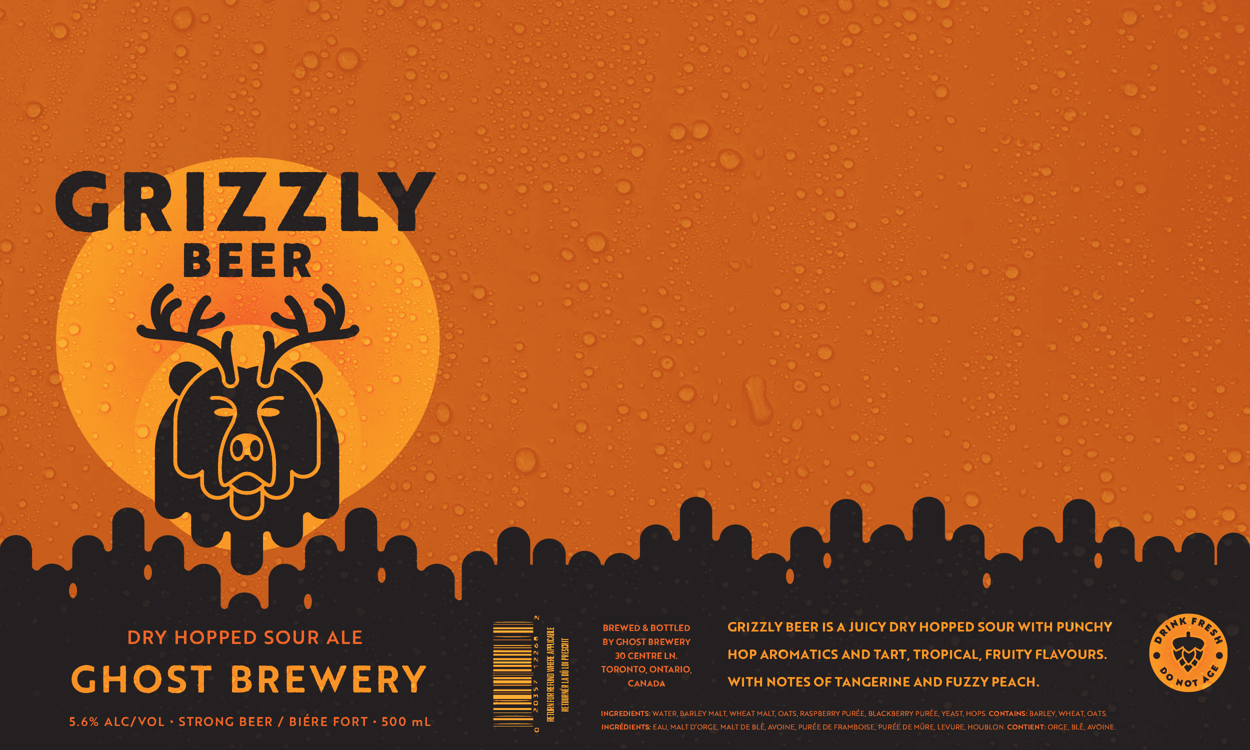
The project covers the full packaging pipeline from concept and illustration through to 3D mockup and motion, all within a tight one-month school deadline. It's a good example of building a cohesive brand system from scratch where each variant has its own personality but the series holds together as a whole.
The project covers the full packaging pipeline from concept and illustration through to 3D mockup and motion, all within a tight one-month school deadline. It's a good example of building a cohesive brand system from scratch where each variant has its own personality but the series holds together as a whole.
The project covers the full packaging pipeline from concept and illustration through to 3D mockup and motion, all within a tight one-month school deadline. It's a good example of building a cohesive brand system from scratch where each variant has its own personality but the series holds together as a whole.
Outcome
Outcome
